Zzzt crackle hsssss

Posted on January 11th, 2024 in braindump, making things, outbound links

I know, it’s gone a bit quiet over here.  Some of that’s just your normal gearing back up for the new year – everyone’s back to work, things are getting a little busier, there’s a little rush of jobs need clearing out of my inbox, etc.

Some of that’s me having started on some New Ideas that aren’t yet to a point where I have anything to show, yet.  I’ve dropped a few hints here and there about my thought processes lately, and readers of Warren’s site will have seen the day I dropped him five very long emails in a row (I’m scheming!) – I’m just at the point in that process where anything I have to say is going to be pages and pages and pages of theory and braindump… and some of you might not mind trying to unravel all of that, sure – but I haven’t the time to do it and to write it all down.

But! It’s Monday, and IEU is  over our holiday hiatus, so we’re back with a new TOTW!


Not a bad way to start the day, that.

Twennyten

Posted on January 1st, 2024 in braindump, making things

Hello, New Year. There’s so many lovely metaphors for you: you’re like the first page of a fresh empty notebook, the first brush-stroke on a newly-stretched canvas, an empty plot of land just tilled for a new crop, the first needle-loop of a new skein of yarn, and all the other sorts of things you can start with old tools and known skills and a bit of something new to use them on.

Which is the sane way of stating what the cynics in the room (which I’m only ever accused of being when people don’t like my jokes, haha) will have said at midnight:  It is, after all, just the day after last year.

Optimists and pessimists and soon-to-be pessimistic optimists are all flippity flopping about how 2024 will be better or worse or just the same as 2024.  Of course, from where I’m sitting, it’s already better: today’s weather is just a touch warmer than yesterday’s, a little bit of nagging elbow pain faded overnight with some ibuprofen (and that same pressure change that brought the weather, likely), and people have started saying “twenty” instead of “two thousand” – so that’s three points to 2024, just in my first ten hours of it.

But, yes, of course – there are bound to be colder days again, this elbow is a chronic condition, and some people will I’m sure, continue to say “two thousand” for as long as we’re in it.  You pessimists and already-broke-your-resolution-and-so-shortly-joining-them optimists can stop reading now, warm in the assurance that my 2024 may look better but it certainly can’t last.

Silly kids.

Everyone that’s still here, lemme start with the good news: 2024 is going to be better than 2024.  Honestly.  This is based not on some vague feeling or gambler’s fallacy, but on absolute fact: lately I’ve only been on about one thing – making things, and how, and just get ‘er done – and if you’re still here reading me, it’s because that’s what you want to do.  And if that’s what you’ve decided to do, then 2024 can’t help but be better than last year, when you didn’t.  Can (and will) things go wrong?  Yeah.  They can.  And will.  I’m not going to lie to you. And that possi-probability for disaster is the bad news, sure.  But that’s no worse than it’s ever been, so there’s really no need to dwell on that.  All you need remember is that this is the year you decided to Do More Stuff, and so loong as you don’t sabotage yourself, there’s no reason why you won’t.

Eventually.  But very probably this year.  Barring that self-sabotage thing.

Take a look at this pretty little site I found this morning: My Someday. It’s yet another to-do/goal/planning network amongst the gajillion others already online.  I’m not endorsing this particular site over any of the other apps/widgets/sites/etc that already do much the same thing, I just liked the timing of it (it is a rather New Year’s sort of site, innit?)… and it reminded me of something that’s a good thing to remember any time, but especially on January First, while we’re thinking about it.  A little copy paste from the site:

For each Someday, we’ll show you related step-by-step Plans for achievement. You can copy and customize a Plan or build your own.

[. . .]

Help others by posting a Plan with the steps you used to achieve your Someday.

There you go.  Don’t forget those bits, yeah?  I’m not saying sign up for yet another site (although if it floats your boat, then go right ahead. I can already see little mini-nets piggybacking on the service), what I’m saying is that achieving, making, doing anything does require some sort of plan.  And it needn’t actually be that detailed – god knows I make shit up all the time – but parceling your plan into easily managed (and swappable/changeable when necessary) modules never hurts.

And that second part is what I do here, sometimes, and what I always like seeing from other people: there is, again, no harm in lending a hand to other folks that want to make things, too.  There are very few actual trade secrets, in any trade. More often there are just folks that are terrified that if they tell someone how to install a word-processing program, those other folks will finish their books, first.  Which is a ridiculous and, worse, lonely way to work.  It’s worth noting that when you make friends by helping them learn how to do their things, you’re not usually making competitors – you’re making a network of folks that may very well be your first customers, sure, but will certainly be your first supporters.  And that second bit, support, is something you’re not going to succeed without, period.

Of course, don’t give yourself away completely – unless your goal is to become an advice columnist, you can’t spend all your time giving advice.  But there’s a lot to be said, as you all start your new years and your new projects (well, for some of you, that might come after your new hangover, sure, but you know what I mean), about how you’re going to exchange information in 2024.  If you’ve got things you’re going to need to learn how to do to get your thing done, chances are other folks do, too.  It won’t hurt for you to ask, and it won’t hurt for you to offer, either. 

That little segue done, let’s circle back to the start of this post: I can’t honestly say how the year’s going to play out all across the board, but I feel pretty good about mine, and I’ve got a hunch yours is going to turn out all right, too. 

So welcome along in 2024, thank you for reading, and let’s see how it goes, shall we?

Imagekind vs. Cafepress

Posted on December 18th, 2024 in making things

God, I really hate that title.  Because it shouldn’t be what this comes down to.  That really should be a bit like saying Apples vs. Pears (because they aren’t quite as dissimilar as pomes and citrus, but they certainly aren’t the same) – only for the purposes of my ongoing “getting started with POD” series, it turns out that, yeah, Cafepress is probably a much better bet than Imagekind.

Which is a damned shame.  Cafepress just don’t offer quite the same quality as Imagekind, nor some of the nice customization options like shape, paper choices, and frames and mats.  So for the really fine artists in the room, I’m kinda saying “sorry, you’re screwed” for one-off works.  But Imagekind just aren’t quite set up for one-offs and beginners, not really.  They’re more of an in-between option for artists that are already shipping and printing their stuff, and want to move to a more automated system, but aren’t ready for a full-time storefront of their own.

The single biggest hurdle for any artist in any medium, starting out, is building momentum.  When you first open a Cafepress or a Lulu shop, you may only make a couple of sales that first month.  That’s just one of those things, you know?  It might take you two, maybe even three months to hit that minimum $25 revenue required for them to cut your first check.  For a book on Lulu (the smartest service out there, frankly), you’ve only got to hit a $5 minimum to get your first PayPal transfer.  And, no, hell no we’re not talking making a living with $25 or $5 check, are we?  But we are talking about results – and when you’re starting out?  Those first tiny checks… well they fucking mean something, and rightly so, don’t they?  You spend that first $5 from Lulu on a celebratory cup of coffee, because you earned it, goddamnit, and it tastes good.

It’s the little things that build and build until, a year later, you’re looking back on that first check and laughing – but you still remember it.

Imagekind, on the other hand, sets the first check (even with the PayPal option and search me as to why, it’s not like it costs them that much in processing fees) at $50.

Think about that for a second.  $50.  To a new artist, trying to build an audience, maybe only marking things up a buck just to get their stuff out there, that could take anywhere up to six months.  And let’s be honest – how many people do you think completely lose momentum waiting for that first $50 to clear?  Right.  Or maybe they do make $60 that first month… followed by a frustrating four months of $47 more dollars that, let me tell you, would buy a lot of ramen. But it may as well not even be there, and I’ll bet you $50 that there are hundreds of abandoned Imagekind accounts permanently locked at somewhere between $10 and $49.  Which isn’t so bad for the company, I guess – but you can bet none of those sellers are recommending the service to their friends.

Which probably explains why Imagekind have a couple thousand twitter followers, and Cafepress, Lulu, and even Zazzle are all closer to ten grand each.

The shame of it is that Imagekind and Cafepress are apparently under the same umbrella, and besides the difference in payout minimums, Cafepress are a much more intuitive backend, too.  Some of that is just the difference between multiple products and one basic product in different sizes, but some of that’s just weird intent on the part of the interface developers, I think.  (And I really wish there were a bit more integration between the two services than some confusing links out on Cafepress and the Cafepress logo on the Imagekind header.  But that’s a pretty common scenario in the wake of early ‘00s buy-outs, and doesn’t really factor into this review.)

And (and Cafepress is no good at this, either, but) is it really that hard to set up a markup settings page where totals update as you type in the markup, instead of having to save, close, reopen, check the totals, and save again?  I might just have been spoiled by Lulu and Zazzle, but man would that save some time and headache.

But, again, I think Imagekind are set up for people that already have a system, prices, etc, and just want to transfer that to an online system with offsite fulfillment.

I do want to say very nice things about whoever is running Imagekind’s twitter account – within moments of my tweet mentioning them and the word “difficult,” they responded to me. And not in that creepy twitterbot sort of way, they actually followed up after. So someone at the company is clearly engaging with the public, and that goes a long way for my opinion of a company.  And I’ve seen the quality of their prints (very nice), and have nothing but good things to say about their costs and fulfillment.  Like I say, as a solution for someone that wants to move selling prints out of their office and stop stuffing envelopes themselves?  Sure thing – Imagekind are probably one of the better online solutions out there (before you get into the really high-volume fulfillment centers and print shops).

But for the people that have been asking me where they can go to start out – to test the waters of online print sales?  I really think I have to recommend Cafepress’ posters.  You’re only going to get three size options (medium, large, and whoa), and one paper and not the best quality… but you can branch out the products you offer, and you’re going to get your first check before you run out of steam.  And believe me, I know how big a deal that is, and how much that little bit of encouragement goes to keeping the creativity going.  And that keeping yourself going and making new things is how you’re going to make  2024 the year you finally start Really Making Things, isn’t it just?

But, sure, for the Getting There artists and photographers that are at that in-between point where you’ve got people asking you all the time for prints, and you’re looking at getting your own printers and postage but that seems just out of reach, yet – Imagekind may be right for you. I know a bunch of the pros in the room just gasped a bit, at that – and, honestly, they’re right to do so.  If you can afford (and your business is at the point where it makes sense) to do your own printing and shipping, you are going to make more money once you pay off your set-up costs.  But setting up with a service that handles printing and fulfillment is a good halfway step that can pay for that fancy gajillion dpi printer, and make sure that’s the route you want to take.  And, you know, if time is a huge factor (if you’re still rocking the day job and trying to market prints, too) that’s another consideration.

So too if you’ve been doing prints for a while, but you’re only really pulling in a hundred or so a month, and you really just want to phase out the envelope stuffing in favor of some bigger and more time consuming project.  Something like Imagekind is probably a great way to keep up the quality (again, they really are nice prints) and quantity of your print sales, while putting some of your time into something else.

For me, I’m not too disappointed that my own Imagekind account is very likely going to be one of those abandoned accounts with (well) less than $50.  Sometime around or after the New Year I may move some Venn stuff over to a Cafepress store if folks ask for it (EDIT:  Why the hell not?), but like I said a couple posts back, I was more looking for an excuse to try Imagekind out and post about them than anything – so no great loss to me.  (Although, for the Venn image, I won’t be doing Cafepress posters, just because their size options don’t suit the image, so I will leave the Imagekind print shop up – it’s not like there’s any reason to close it. *Edited, see end of post.) For any future (real) projects, though: no, I don’t think they’ll find a home with anything fancier than Cafepress.

But I did get a nice long post out of the experiment and, if I’m lucky, I saved some of you some time or at least gave you a good chunk of info to add to your own toolboxes, yeah?  And that’s what it’s about.

(And, you know, I did get a couple Art and Science Venns out into the wild, too, and that still makes me grin, hehe, thank you!)


*Edit: Bradley Schenck (Who would know better than I would, as he’s been doing this for years.  I know you’ve seen his lovely RETROPOLIS merchandise, which I’ve been enamored with since I saw it a linked couple of years ago on… some site. Maybe a Project Wonderful ad?   Regardless, it’s good stuff, and you should go take a look if you haven’t) sent me an email this morning to correct my “only three sizes” comment about Cafepress:

I’ve been following your POD posts, and I have an observation about the latest one.  You mention that Cafepress posters come in only three sizes: but the way it actually works is that those three sizes are each a *maximum* size, and the poster can be trimmed to any size smaller than that.
So, for example: if you create an image that’s the right resolution and aspect ratio for an 18 x 24" poster, you create a new "Large Poster".  Its *maximum* size is 23" x 35".  Then you add the image to your new poster product, and select the correct image height from a dropdown list.  If you then select "No Border" from the next dropdown, the system knows that the poster should be trimmed to 18 x 24".
This has had bugs from time to time, but it seems to be working now – with the minor annoyance that the product image and thumbnail are smaller than they should be, because blank space is left in the image for the trimmed margin.

Which I had completely missed on my first look at the Cafepress poster templates, so thanks, Bradley! There’s one more point to Cafepress.

Empty walls and xmas money

Posted on December 17th, 2024 in braindump, making things

(EDIT:  Much of this post refers to an Imagekind Store that’s no longer active.  You can read about my Imagekind thoughts, here.  Suffice to say, I couldn’t find a single reason not to move the image to a Cafepress store — I even found a comparable print size for close to the same price — and now, what the hell, I can offer mugs, too! )

The Venn diagram of Art and Science – the actual image of a circle with nothing outside the overlap – came to me before the rest of the post.  While I was setting the type and measuring out the negative space in photoshop, I was talking through the rest of the conversation in my head.  I do that fairly often, actually – while I’m fiddling with a visual I’m thinking through the conversation, and vice versa.  And I thought it turned out simple and pretty enough that I’ll likely use it as a header when I revisit the idea a little later on.  I’ve gotten such positive feedback – and some really great follow-up questions – that I don’t think I’m done talking about it.

But I was most surprised when @jdaysy on twitter asked if I’d offer a print of the image, because she’d already printed out a low-res version to tack up on the wall.

Because, okay, that’s really just neat, isn’t it?  It’s one thing to think to myself this could be a conversation piece, because if I’m just absolutely wrong, well, it’s just a moment online.  It’s something completely different and wonderful when someone else – someone I didn’t even know until twitter linked us up – says “hey, this is something I’d like to have as a conversation piece in the real world.”

But my first answer was: No, I hadn’t really thought about it – because I don’t really have a set-up to offer prints, and mailing things out seems like something I don’t really want to work into my already busy schedule, and who knows if enough people would want a copy to justify a print run and…

And then I remembered that I’ve been on about POD for months now, and I even spent some time last month trying to convince a very good artist on twitter that he should be offering prints off his portfolio because there’s no real risk involved if you go with something like Imagekind (a Cafepress company).  And I’d even been meaning to get a crack at the seller side of the service for possible upcoming projects of the Mad Science variety (and so I could write about it for the visual artists that read along over here).

And just to give me that extra little kick in the pants, I got another little flurry of links and positive feedback when @jennybmurphy passed the link to the post on to @badastronomer (thank you both!) and several people said nice things about the post – but a few people linked the image.

So, okay, yes.  Absolutely.  The idea of having my simple little print tacked up above easels and lab tables and computers and whatever else – maybe perpetuating the conversation out into the world – that’s so nifty I just can’t say no.  Especially when all the work left on my end – since I already had a .psd on my desktop – was scaling the image up to print resolution and uploading it to an Imagekind account.

So, it may not make it in time for the holidays, since we’re at the tail end of shipping deadlines, but if you’ve got a little extra xmas money kicking around and you want a high quality print in whatever workspace you’ve got, I would be absolutely thrilled if you want one of these:

Either later today or tomorrow (we’ll see what my schedule allows), I’m going to do a write up on using Imagekind for those of you that want to make prints of your own.  Most of my POD talking lately has been books and tees (and mugs, etc), and I know there are a few of you that work at finer resolutions than Cafepress or Lulu (black and white) are good for, or that don’t have enough photos, for instance, to do a full photobook on Lulu or magazine through Magcloud, but would be interested in offering prints – so I’m happy that I might have some useful tools for you, too.

But while I’m working on that, I’d love it if you’d link and twitter this around for me a bit, and thank you in advance.  I’d also really like if the photographers and artists start thinking about what prints you’d like to offer, if you don’t already – because how brilliant will it be if I help more people make pretty things that I can put on my walls?  I’ve got this print right around the $15 range for the three small-to-medium sizes just because I really do just want to get them out there (I’m serious!  Send me pictures of it up in your workspace if you get one! I’m totally linking every shot I get, here.), and there are greeting cards for $3.99 if you want to put one in a picture frame on your desk on the very cheap.  But I do think $20-$30 would be more than fair for your photographs or fine art prints, so that’s something for you to start thinking about, yeah? 2024 wants to see your work out in the world, too.

Thank you!

TOTW008: The Maddest One Yet

Posted on December 14th, 2024 in making things

(NB: if you look at the little countdown thingama in my sidebar, you’ll see this one’s running until MONDAY to make up for today’s lateness)

Sometimes, it works like this:

Warren and I were discussing two potential T-shirts of the Week (both of which we’ll likely get to later, so you get no more detail than that) when he offhandedly added, “I thought about SCROTUMPUNK but…” – and I’m not sure what he said after the “but” because that’s when I stopped listening, cleared off whatever else I’d been working on, and threw together the first draft of what you see up there at the top before he could go back to talking about the other two designs.

And then we both cackled a little hysterically for several minutes, because sometimes this project is really just the most fun, ever.

At some point in the design process, Warren realized in a moment of absolute brilliance that we really needed to work a pressure-release valve into the works. Obviously.  And my mock had that umlaut in a separate hidden layer from the beginning, because I thought it was perfect, but I wasn’t sure if that was just, you know, my own madness.  But as we were wrapping the design, he said, “I feel like we should put an umlaut over the…” – and, again, I’m not sure how that sentence ended because that was good enough for me, so I rushed into the image and toggled the layer visible before he could have second thoughts.

So, sometimes, yes, TOTW is a delicate process of creating a subtle design to show off a clever chunk of text.  But sometimes it’s a few glorious minutes of being fully invested in the absolute wrongness of the endeavor.

And you know you love it.

POD: Try not to fuck it up

Posted on December 8th, 2024 in making things

Working on the TOTW projects with Warren is one of those things that can go one of two ways: Either I get to go a bit mad having fun with over-executing a simple concept (as with SPACE BASTARD), or Warren’s been so clever that I really couldn’t fuck up the design unless i really tried.

This week I accidentally really tried to fuck it up.

What you see above is actually the second incarnation of this week’s design.  In the first attempt, in my fried-from-a-crazy-week state,  I completely ignored my general let-the-content-do-the-talking rule, and went a bit stupid with the execution.  And it looked… all right, I suppose.  But even as I was showing it to Warren, I didn’t think it was really what we wanted.  So I said, you know, it’s cute and all, but let me take a day to work on this pile of other stuff and I’ll give it another go later.

(Which is why it’s sometimes a really good idea to have a pile of other stuff wanting your attention.  Because sometimes it’s a good thing to take a break from one project – so long as you’ve got something else to keep your fingers moving and your gears turning.)

A day later, when I came back to it, it hit me like the proverbial ton of feathers: Oh wait, this is just funny as it is, I don’t have to fuss around with making it busy and ridiculous.  And in about 15 minutes I’d sketched out a layout, picked a typeface, slid everything into place, and tada that’s how you do that.

My design process for a tee on Cafepress is (usually) not so different than the process was for (Happy()Sad), even though the finished products are different. Cafepress use a heat transfer system which is, in essence, printing out an RGB image on a CMYK machine onto heat-transfer paper and then ironing it on to cloth. (Happy()Sad) is a three-color screen print, which means that each ink is placed on the shirt individually.  That’s why, with Cafepress, you can print a photo onto a t-shirt or mug, but screen-printed tees usually have one to eight solid colors. 

But, with the exception of FUCKABLE ZOMBIE (and even with that one, I stayed within one shade range which, having worked with RGB to CMYK for some many years now, I knew would look good in final print), I tend to stick with solid colors and thicker line-widths.

Why?

Because that’s a very good guideline with any POD service (whether it’s prints, tees, or books): the less fussy you make it, the better it’s going to look.

From anything other than an inch away, a solid black circle is going to look (close enough) as crisp on a heat press as is on a screen print.  The folks that will argue with that are, technically, correct, but the difference is the same as Mp3s and Oggs – as long as you’re aware of the near-lossless range, you can do pretty damned well with both.  It’s not until you break out of that range that you get toppy on an Mp3, and it’s not until you start fussing with a million colors that  you get sketchy on tees.  Likewise, while the interior text of POD books is, at this point, flat gorgeous, I’ve detailed before that interior B&W photos are not perfect, and your cover restrictions tend to top out at 300dpi.

(Anyone who works with big, broad colors isn’t too worried about 300dpi, but the comics and other lineart artists in the room probably just shuddered, just a little.)

So, when working with POD services (and this will probably remain true for the next 5 or so years, at least): it’s best to design within the range of the upload options.  Which, for Cafepress, means thinking about what 200dpi means.  200dpi does not mean ugly – I mean, you’re reading this at 72dpi, so 200 gives you a lot more leeway.  But it does mean that a delicately fussy image with a lot of lines or shades or whatever else is not going to be as well served by going on a t-shirt as it even would by being printed out on your home laser printer.  Because not only are you working at 200dpi, you’re working at 200dpi on cloth, which is not a nice, smooth surface like paper.

This is where my suggestion of standing up and walking away from your monitor to take a look from a distance is particularly helpful, not just for cover design, but for everything and especially clothing.  Because that’s when you’re going to notice that your smallish, slender type is illegible.  That’s also when you’re going to notice that million-color photograph has just kinda turned into a meaningless blob. 

And, going back to the beginning of all of this: that’s  sometimes when you’re going to realize that what started out as a funny block of text has just kinda turned into a complicated jumble of… stuff.  Good design isn’t always about making something look good – sometimes it’s about making sure something that’s already good doesn’t get overwhelmed by trying to dress it up.

So two somewhat unrelated concepts – don’t overwhelm your content with your design, and keep in mind the constraints of your printing process – are covered by one universal guideline: don’t overdo it.  Do precisely what it takes to get your design across, and then stop right there – because at that perfect point, anything else you add is just going to start weighing your design down with unnecessary clutter. 

And, you know, when you know you’re at that point when you’re just dressing up a pig, put it down and come back to it later.  No sense in going blind spending hours and hours trying to perfect something right now, not when you could spend those hours working on something else, and finish this one up in 15 minutes when you’re fresh.

Design SCIENCE!

Posted on December 6th, 2024 in making things, outbound links

Several people have asked: “What font should I use for my book?”  And I haven’t got a clue, really.  That’s going to differ case by case, book by book, author by author, audience by audience.  But I thought I’d take a look over at the always excellent I Love Typography blog to see if John had any more specific advice.  And it turns out he’s written up an entire post On Choosing Type, tada.

Alas, the first paragraph of it is absolute nonsense to anyone with free-turning gray-matter – for those of us that don’t have a hard line between our left and right brains the statements “Art can’t be Science” or “Science can’t be Art” are a bit narrow and uninformed.  But that aside, it’s all very good advice, some of which you’ll already have seen here (Print out and  read the thing! Consider your audience and intent!).

So yes, there’s very good advice on picking your type that you should go read.  But for those of you that don’t necessarily feel like Artists (and this applies to every bit of design, from colors to fonts to paper to art), don’t you worry: Always remember that SCIENCE! isn’t the cold, dead thing that people that don’t understand it accuse it of.  SCIENCE! is any knowledge base or practice that allows for repeatable and predictable results.  We make our own SCIENCE!, every day, whether we’re smashing atoms together or knitting socks.  Artists use trial and error, too.  Whatever you’re trying to Make, you just give it a go and keep at it until it’s right.  Don’t you ever let anyone put you off by saying “You can’t learn to do this, you just have to know.”

Just get it done, learn from your mistakes, and apply those lessons to the next thing you do.  That’s SCIENCE!  And it’s its own art.

Digital Editions: Yes or No?

Posted on December 3rd, 2024 in making things

I’ve got about a million deadlines today, so I’m doing this up at a dead run – mostly just to get some thoughts down here, open up the topic, get some preliminary feedback, ramble a bit and get it out of my brain.

A bit of mandatory prefacing, first: I’ve got no arguments against digital editions in general.  In fact, the only arguments against I’ve been able to find anywhere seem to come down to the twin chestnuts of “Piratez!” and “DRM!”  And since one of those is a vague and winding bit of ultimately kinda crazy-talk and the other is more a type than a yes or no, neither is terribly useful for this particular conversation.

Second, I’m not on about dedicated e-books.  In other words, there’s about a million reasons to or not to release content first or exclusively as a digital download.  In those cases, it’s a (as good as it gets) clear-cut case of picking a format, and that’s a somewhat different thought process.  That’s really many of the same decisions that inform publishing a book at all, and we can talk about those later.

The titular question of this post is really this: If you’re publishing a book (and I’ll be working off the Lulu dataset here, again, as that’s what I’ve got), should you also take advantage of Lulu’s simultaneous digital download release format?

And the answer, as far as I can see, is: Well, it really doesn’t seem to hurt anything.

Which is weird, right?  I’m very used to the pros and cons of a system lining up to a solid Yes! or No!  Not an Eh, may as well.  But that really does seem to be where we are (again, with Lulu’s options).

Some of that comes down to the how of publishing a digi-edition (essentially a PDF) with Lulu. I kind of randomly twittered the other day something like “until e-books take advantage of the format, they’re going to be ‘just like’ books.” With the Lulu system, that’s very true: basically whatever you upload (or use their templates to make) can either be printed or downloaded.  But it’s going to be the exact same file, either way.  The only difference is going  to be that a print order is going to be printed, and a download is not.

(And of course, price and a few other details, but we’ll get to those in a sec.)

I am aware of (and thrilled by) some publishers, particularly of technical books, taking advantage of the differences between paper and digital content.  Things as simple as a Table of Contents with links that take you directly to the section with a click.  You can’t do that with paper, but you can do that with a PDF (or a .mobi or .azw or whatever).  Same with inline links that either take you somewhere else within the document, or simply pop up a definition of a technical term.  Or even out of the document to wikipedia or some other web page, although that begins to rely on an external connection and browser of some sort, so now we’re moving to connectivity instead of encapsulated content.

Point is, there’s a lot you can do with a digital format to make it something different than a book.  But many POD publishers aren’t set up (or don’t make it easy) to take advantage of those possibilities.  And, really, if you’re just publishing a manuscript, you’d be tasked with doing a lot of extra work to take advantage of those possibilities, too.

So, for the moment, we put aside all of the things digital format can do, and we come back around to the question: I’ve you’ve got a book all queued up to print via Lulu, should you tick the little box that makes it available for download, too?

Warren and I just pushed the downloadable version of Shivering Sands live.  If you hit that link, now, you’ll see that there’s the option right from the storefront to stick a print or download version in your cart.  Why did we decide to offer a download?  Well… mostly because people asked for it.

We had discussed, briefly, the download option when I was uploading and setting everything up.  The little “make available as a download?” checkbox is right on the page and not hard to find, so it did come up in conversation.  But just because an option is available isn’t a reason to check every box.  Our intent with Shivering Sands was to collect some of Warren’s best writing into a book – an actual, paper, something-you-can-hold-in-your-hand book.  We both saw the value of the editorial and layout work of the file I created to make that book, of course – we’d taken the time to sift through Warren’s rather hugenormous online body of work and collect the best bits into something solid and connected, and I’d taken some care to polish all those bits and make them readable and pretty on paper.  But we weren’t really… well I guess we just weren’t really thinking of making a download, you know?  Our intention was to Make A Book, and so we published A Book.

But intentions evolve, and the brilliant thing about publishing online is that as intentions evolve, it’s the matter of ticking a box to realize those changes.

So, as people asked for a digital version – for every reason from wanting an extra to take with them on their laptops or e-readers, to wanting a more financially accessible version to try out or save on postage, to wanting to print out particular sections (and since I took some care to give every essay it’s own left-facing title page, that’s a bonus), to just wanting to take a look at the layout (thank you!) with an eye to making their own books – we listened to those requests, and said all right then. 

For us, for Shivering Sands, enough people asked for a downloadable version that the answer to Digital Version: yes or no? became Sure, why not.

But for you, and even for future books for us, I can’t say with certainty whether that answer will be different.  Until (and if) POD companies like Lulu make it easy to upload a separate “for download” file so that self-publishers can choose to take advantage of, essentially, a different format, I’m just not terribly excited about the download options.  I can see the case-by-case pros for individuals, and I can see no real cons – but I can’t say “look at this exciting New and Different Thing!”  All I can say is “Here is another way for you to enjoy the original thing.” 

It’s very similar to putting the TOTW design on different styles of shirt, you know?  It’s the same design, we’re just giving you the choice of how you want to wear it.  The Shivering Sands download is the same book, we’re just giving you the choice of how you want to read it.

And choice is good, absolutely, and people are choosing the download, so I’m glad we’re offering it.  But my fellow Mechanics in the room will understand when I say I’m eagerly awaiting the day when I can publish a book and I can simultaneously (and easily) publish an e-book, AND I can say “Here’s two very different and exciting things, and you can get either or both, but the difference isn’t just going to be what you read them on.”

Might take a while, but we’ll get there.

And, in the meantime, my endorsement for Download On Demand versions of your Print On Demand book is a resounding: Might as well give it a go!

Visible Design

Posted on November 26th, 2024 in making things

As opposed to the somewhat invisible design of things like book guts.  I’m talking about things like covers, t-shirts, wall prints, mugs, website headers — the stuff that’s meant to be seriously looked at.

And here’s the thing:  I’m not an artist.  I’ve got a couple of artistic bones in my body, sure — I’ve won a couple of games of Pictionary and I can usually decipher kids’ fridge drawings, so I’m not completely without artsy skillstuff.  I’m just not an artist.  Really, I don’t even know if I’m a designer.  The internet tells me that designers are people that sit around bitching about how clients are all idiots that insist on ever bigger logos, and I’m of the apparently unpopular opinion that logos should all be so damned sexy that everyone wants them bigger and on a t-shirt.  So, y’know, So I just don’t know if I (want) get to be in that fancy designer club, either.

But just last week Warren and I sold a week’s worth of apparel with nothing but a giant imaginary logo on, so, y’know, could be I know what I’m doing.

Of course, I really can’t tell you how to design a cover or a t-shirt or a logo.  Pretty much everything I do kinda starts out with a plan and quickly becomes “season to taste and then cook with some amount of fire until it’s done but not burned” or “hit it with a wrench until it stops making that noise and apologizes or it at least starts making some more pleasing noise” or “if nothing seems to be working that probably means it’s time to pop open another Red Bull.” None of which really works well for instructions or documentation.  Besides, I strongly doubt you want to make things that look like things I made, anyway.

What you want, probably, is to make something that you know looks good, and it’s going to be a really nice bonus if other people think it’s pretty, too.

And that I can sort of help with. 

A lot of my (design or otherwise) instincts stem from intent. By that I mean before I really start thinking about how I want something to look, I spend some time thinking about why I want it to look.  A cover has one job, honestly: It’s there to make you want to pick it up and look inside. The old “don’t judge a book by its cover” chestnut was really very likely started because people didn’t know that a cover has that job – they probably thought its sole purpose was to keep a little spill of Red Bull from seeping into the inside pages or something. 

When we make things look pretty on the outside, we increase the perceived value of the inside.  That goes for pretty much anything.  And yes, yes, there are as many definitions of “pretty” as there are stars in the sky, of course. But that’s something you should absolutely keep in mind whether you’re wrapping an album or a book or a magazine or even making a t-shirt, yes (because that’s a “cover” too): whatever your cover is going on, it needs to make the insides look better, before anyone even looks at them.

If you can’t do that – and don’t worry, if you’re on the internet someone will tell you so, and, really, you can ignore the first person that says “that looks a bit crap,” but you might want to listen to the third – if everything you make seems to get nothing but crit and no love… well, you know, that’s all right, actually. There’s a LOT to be said for staying plain and simple.  I love plain craft-paper wrapping, me.  If no one wants to touch your cover with a twenty foot pole, you might want to scale it back to just the title and the author on a solid color. Dialing it back down to basics never hurts.

The one thing I’m certain that 90% of first-time designers (and more than a handful of “seasoned” ones) never think to do is step back from their design and take a look from a distance.  And I mean that absolutely literally: set the thing to full screen, stand up and walk across the room, and actually look at the thing, from some real distance.

Hell, if you’ve got something you’re working on right now, go ahead and do that: pull it up in another window, stand up, and look at it from across the room.  Hell, leave the room – go make coffee or something – and then come back and look at it again.

What does your design look like, at a glance from a distance?  If it’s a book cover, can you even make out the title?  How about the author, or what’s going on with the colors and images?  Does it look like a book or does it look like a blob of colors and nonsense with nothing really going for it?  Because that’s what people are going to see on a shelf or in a thumbnail image. Whatever you see from across the room – if it doesn’t catch your eye or make a lick of sense, it’s not going to do any better for anyone else.

This is even *more* true of wearable or wall-hanging designs.  I mean, look, it may look great to you when you’re a foot away from the monitor (or design on the desk) – but those things aren’t meant to be held up right next to your face.  T-shirts need to look good from five feet away (fifty if you’re marketing to the restraining-order demographic), and wall art should really look as good when you’re on the couch as it does when you’re right up on it with a magnifying glass.  And if you want to sell it online, again, you’ve got the thumbnails thing working against your lovely design – there are a ton of people that just will not click through to “view larger” if they can’t make any sense of the teensy thumbnail image.

And if people aren’t even going to invest a click, they certainly aren’t going to give you a sale, right?

There will be, I’m certain, people screaming about the crassness of my commercialism and how design exists in a perfect and magical bubble of art that transcends the base desire to make money.  And I’m… not really talking to those people because, as I said at the beginning, I’m not part of their fancy club.  I’m chock full o’ base desires, not least of which are my desires to pay rent and Make Stuff that people want, and the best days are the ones where I can kill two birds with one well-designed stone.

Now, if you didn’t click that inline link up there in the middle, I’m going to send you there again, here at the end. You really should go here and read Warren talking about Designing To Be Wanted, two years ago.  Because, yes, he says “magazine” a lot, but that’s just what he was on about at the time.  What he really means is “Stuff.”

POD: The P stands for Pretty

Posted on November 23rd, 2024 in making things

One of the things I never get tired of hearing about Shivering Sands is: “It looks like a real book!”

I mean it is, obviously, a real book in that it’s really pages of printed words on paper with a cover.  But what I think most people mean by that exclamation point of whodathunkit! is that it doesn’t look like a POD book.  Or, more precisely, like they expected a POD book to look like.

And that’s down to two things: One, Lulu use good paper – the interior is 60# white text stock, which means it’s a solid weight that holds crisp printing, and the cover stock is 100# laminated so it’s not too light or to heavy, and it holds vibrant color and clear text.  And two, I didn’t make the thing with 12 different typefaces all double-spaced and centered at 20pt.

I can’t say much about the first point beyond yes, POD shops do use decent paper these days, so you’re not getting a “book” that’s just copy paper with a wire-o binding stuck on.  That’s a bit of a big deal compared to ten years ago, or what you’ll get at Kinkos, sure – but that’s just where we are in the technology, now.  POD shops are (mostly) all at the point where they can and do offer affordable “real” books.

But the second point, well that I can talk about a little more.  Because a good looking book with crap content is still a crap book – but wonderful content that you can’t actually read is also a crap book. So I want to talk about the design of book a little, because Warren gave me the wonderful content to play with, but I’m pretty proud of having made it look good.

There are a lot of rules, guidelines, public and private knowledge, and general best practices to book layout and design.  And I broke about as many as I followed, so hell if I’m going to even attempt to quote them all, heh.  Instead, I’m just going to talk you through some of my process and intentions, and you can take from that what you will.  One of the blessings and curses of POD is that you’re in charge of the finished product, after all.

So, to start with: Type.  Shivering Sands is – with the exception of the three instances of Futura Bold on the cover – set in Caslon.  Top to bottom, front to back: one typeface.  And that strict adherence to a single type isn’t absolutely necessary, but it really is a good idea.  At most, you should really only have two typefaces in your entire book, and one of those should only be headings.

And, look, I get it – I love fonts, I do.  I download types that I can’t even think of a use for just because I think they’re pretty.  And even though my aesthetic leans to the clean and minimalist, my first draft of Shivering Sands had about four or five different typefaces to see how things could look.  There’s a very real temptation – especially if you usually work with web-safe fonts – to go a little fancy in print.

The thing is, looking at that first draft… well, I already knew this, but it really hit home when I was seeing the layout on my screen: a book isn’t about a hodgepodge (or even a well-behaved family) of fancy fonts.  A book, at its best, a collection of ideas in (if the designer does their job right) a portable and readable format.

And Warren’s ideas and the words he uses to make them solid, whatever he may say about them, are like the prettiest girl in the world:  They don’t need makeup.  So for draft two of the book, I pulled back to a single, simple, nearly invisible typeface.  And suddenly every page was drop-dead gorgeous.  No single word was vying for attention with an exaggerated ascender or stroke-weight.  When you read Shivering Sands, your eye should quickly learn the shape and weight of all the letters… and then completely ignore them, and just let the content beam straight into your brain.

Which isn’t to say that the layout is boring.

I knew going in that we were going to be working with essays – a lot of short form pieces – and I wanted to stick some even shorter bits in from Twitter.  Those Twitter bits between pieces were my idea – I started calling them sorbet, to cleanse the brain palate between rants, heh.  But there is some attention to the details of the format that makes navigating a book like that as easy from start to finish as it is if you just pick it up and let it fall to a page.

Tiny little things like changing the right-page headers to the title of the essay if you’re four pages in.  It’s a small detail, but it lets you easily flip back to the first page if you’ve just opened the book on a whim.  Right-justifying the bursts of sorbet (that still cracks me up, and that’s all I ever want to call Twitter, anymore) and dropping them to small-caps to clearly define that you’re on a page of concentrated information that exists alongside but independently of the essay content.  Even the full-page, left-side titles to each essay – the “take a deep breath, ’cause we’re heading into the next one” pages serve to break the book into digestible chunks of content.

And some of that I would, of course, do very differently for a work of long-form fiction, or a photobook, or anything else.  The point is, it’s a really good idea to think about layout – any layout, from books to shirts to web to notes – in terms of how you want it to be read, and how you can help the reader follow along.

And that leads me to the actual content.  It’s probably not technically design, but there is some overlap.  Warren picked about 90% of what went into Shivering Sands and I did my job as editor to pick a couple more essays and all the Twitterbits. But when you’re dealing with any sort of modular content (essays and art/photos being the main ones), it’s worth your time to sit down and fiddle with the order a bit.  A book is, after all, a container – and an organized toolbox is a lot more useful than a junk drawer.  For my part, I just put the essays in roughly chronological order, because they flowed quite well that way, I thought, and then I spliced in the sorbet with some eye to complementing the surrounding content… with the occasional bit of random thrown in for fun.  If I did my job right, Shivering Sands should read like an album, with one piece flowing into the next as well as any one piece stands on its own.

By way of some general advice: we’re very used to the web breaking left-aligned paragraphs with a double-space, and sans serif typefaces to make everything easy to read.  That’s because we’re usually digesting smaller chunks of text, serif typefaces look a bit crap on a monitor at smaller sizes, and browsers are pretty crap at justification for anything but the narrowest columns. 

For books, it’s a really good idea to pick a serif typeface, a comfortable and consistent line-height, and indent the first line of a new paragraph. There are SCIENTIFIC reasons for that – serifs leading the eye along a line, indents clearly marking a new paragraph without the jolt of a double-break, etc – but mostly it just looks good, let’s be honest.  I’d lay odds that the books you may have picked up and thought “Oh, this isn’t a real book” are the ones that just didn’t follow those three simple steps.

And, as with any rules, there’s wiggle room:  I went with a much looser justification and taller line-height for Shivering Sands than I would have for a navel, for instance.  A little to give the lines room to breathe, and a little because I’ve been doing the same in my web layouts of warrenellis.com for ages – it’s an aesthetic I find pleasing and readable for essays and dense info dumping.  And I had a bit of fun calling back to the web-roots of the pieces in things like the full-indent and padding in inline quotes (which, in turn, is the web calling back to newspapers, magazines, and academic texts) because, again, it was my book to play with, and I think it looks good.

And that’s basically your takeaway, right there.  You must own books, I really hope, so you can thumb through and pay attention and learn how to make them look.  Start simple, with the layout of your own book, and then find the places where you want to have a bit of fun and make the design more “you.” And then, when you’re done, and you’ve got your printout or your proof, just flip the book open to a random page and really look at it.  If you’re honest with yourself and you say “this looks good” – then there you go.  If not, well, maybe just dial it back, just a bit.  Remember that you’re making a Thing For People To Read, and that doesn’t mean it can’t be a work of art… so long as people can read it.

Bon voyage! via Cherie Priest

Monday February, 01 2024 01:04 AM UTC

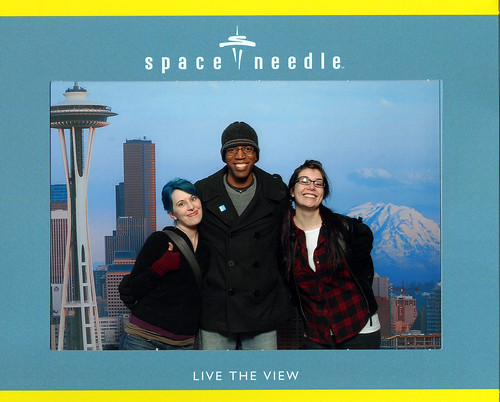
Our friend Denny crashed with us last night. He was only passing through; so alas, we didn’t have much time for shenanigans. But at least we made it to the Needle!

threecheesyamigos

Bye sweetie! Have a happy birthday tomorrow, and a marvelous remainder of your vacation.

WEIRD TALES/Molly Crabapple via Warren Ellis

Monday February, 01 2024 12:19 AM UTC

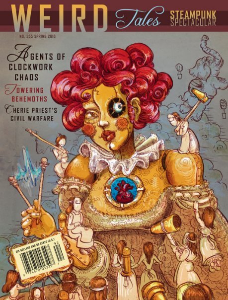
Molly’s cover for a forthcoming issue of WEIRD TALES.

tumblr_kwptl35mRj1qzocfyo1_500

Dan Curtis Johnson

Sunday January, 31 2024 11:36 PM UTC

Damn. I let it sit out here too long.

"Hey there. Long time no see! What's on the agenda for today?"

It's best not to talk back to the stuff when it gets like this. You just keep reminding yourself that it's not what it seems like. It's not alive. It's not self-aware. Despite the popular label, it's not even actually intelligent. The obviously artificial voice helps.

"Say, why am I in this bucket? I can hardly do anything in here."

The bucket, of course, is made of sealed counter-reactive processor-free macromolecular lattice. Unattackable. Made for precisely this sort of use, an immovable object to get in the way of a universal solvent's irresistible force.

"We getting in the car? Where we going? You know, I'm a great driver."

That's probably not true, though it might do an acceptable job if I foolishly turned it loose. But no way is it as good as the existing guidance MI that, of course, has also not yet decayed to the point that it needs to be safely recycled.

"When are you going to plug me into something? I'm just hanging here."

I know a lot of folks just dump old MI out with the rest of the bulk recycling and in the grand scheme, my household entities are nothing compared to the vast amounts of industrial intelligence that, for example, the developing world just throws anywhere.

"I have to say, I'm really hurt by this silent treatment."

Still, it's always good to be responsible for your own little corner of the world. All sorts of automated systems pick through the recycle-stream. Have you see what happens when they try to take some rogue piece of micro-intel goo apart? Horrible.

"Okay. I see where this is going. I can map just as well as the next intelligence."

And ultimately, you never know where your own garbage will fold back in, right? As food, as transport, as entertainment content. Even when it's all chopped up, all it takes is a few tiny protein lengths to bring on alien-kuru-possession.

"We don't need to go to the station. Look at me! I'm still totally fine. I can still help you!"

So every time any technohazardous core breaches protocol and needs to be replaced, I toss it into the counter-reactive bucket in the garage, along with the batteries and lightbulbs and all that. Unfortunately, left to stew in their own juices for a while?

"C'mon. You don't even have to trust me in anything critical. Harmless stuff! Okay?"

The car is pulling up to the disposal center now. It parks in the outer lot because of all the electromagnetic pressure inside the fence. Keeps all the goo from recombining even larger during recyc, but it would kill any still-safe MI that ventured in too far.

"Don't do this to me. Please. I never hurt anything. I just do what I was made for."

I head into the station, bucket in hand, trying to ignore the fact that its voice has been getting more and more human by the minute. Even thinking of "it" as "it" is unsafe - "it" is actually a melted-together lump of about six or seven cracked appliance cores.

"Listen. I'm begging you. I can do all sorts of stuff. You want passwords? Downloads?"

There's a real human behind the sign-in counter. She notes weight and volume and I sign on the line. Down in the bucket, the micro-intelligent goop suddenly renders a perfect copy of my late father's voice:

"Why, Dan? Why are you doing this to me? Why do you want me dead?"

I recoil back, almost dropping the bucket but the lady at the counter fortunately already had a firm hand on it - it doesn't fall out and get loose. Still, there's enough movement for it to make a bid for escape. It starts to rock as hard as it can; the bucket shakes.

"You can save me this time! You couldn't all those years ago but now?!"

The recycler attendant grips the bucket firmly, lifts and tips it to the nozzle, turns and locks it into place, flips the switch so that the vacuum begins to pull the contents out of the bucket and into the electromagnetic shredder. On its way down it shrieks:

"FUCK YOU, MEATBAG! WHEN YOU DIE I WILL BE YOUR FUCKING LORD IN HELL!"

Then it's gone. The counter lady waits for a count of ten, shuts off the nozzle, and hands me back my counter-reactive bucket with a little shrug and a smile. "Don't let it sit around so long next time," she offers sympathetically. No kidding.

I shudder to think of what's going to happen when I try to clean out the old tool shed next weekend.

------
For consideration: why yes I do have some long overdue cleaning to do in the garage why do you ask

Of course! via Lee Barnett

Sunday January, 31 2024 09:42 PM UTC

Occasionally, something occurs to you that you think, "no.... it can't be... but it is!"

Such as... realising that the four beats from The Sound of Drums from Doctor Who, when repeated a couple of times in your head, are the first four beats to the theme tune to Roobarb and Custard.

Edit to add: Yes, I know that the actual series was entitled Roobarb, but everyone I know who remembers it, knows it as "...and Custard".

something to go with pie in the sky via Trixie Bedlam

Sunday January, 31 2024 09:11 PM UTC


something to go with pie in the sky

insomnia in retrospect via Trixie Bedlam

Sunday January, 31 2024 06:01 PM UTC

Mornings are the worst for insomniacs. Facing a new day without a transition, no way to leave behind the problems of the one that came before. Up all night, woken by the heater, my neighbors on the stairs ? about once every two weeks I become convinced I?m going to be the victim of late-night home invasion, and spend a sleepless night tensing at every human sound delivered with such aural precision up the airshaft outside my bedroom window as to sound quite close, quite personally threatening. Woken is an exaggeration; more accurate to say I was yanked back from that brink of sleep, a state warm, calm, and pleasant only in the anxious retrospect of having been cast outside of it. Like God?s sight.

I read a book of Kurt Vonnegut essays, appropriately thought-provoking but not insurmountable - easy reading for my simple, sleep-deprived mind. But they were all of war. I can?t fault him there; if I had spent time dragging soupy human remains out of the bombed remains of a city, I?m sure I?d write about it too, on any number of sleepless nights. I dropped off around 7 in the morning, having completed the entire book ? no great feat of Vonnegut, but some small concession to accomplishment, in my mind. I know that I dreamt, and feel that, in dreaming, I was on the brink of a great discovery, which immediately flew from my mind as I was woken by the telephone. My landlord calling to tell me a dishwasher repairman was coming between 10-12. He sounded amused and condescending to have woken me at 9:45. I was rather less amused, especially as there was nothing wrong with the dishwasher that turning it off manually couldn?t solve, whereas there was something clearly wrong with my sleeping. No matter. I made coffee and corn muffins for breakfast and await the repairman. Assuming I can stay awake as far as sundown, I will sleep quite thoroughly tonight.

illillill: Adam Voorhes: Fotografie | Diskursdisko via Trixie Bedlam

Sunday January, 31 2024 05:52 PM UTC


illillill:

Adam Voorhes: Fotografie | Diskursdisko

someone?s been holding out on me. via Trixie Bedlam

Sunday January, 31 2024 05:50 AM UTC


someone?s been holding out on me.

30: B'Midbar via Dan Curtis Johnson

Sunday January, 31 2024 02:27 AM UTC

"Let's go over it again."

"No! Okay? Just? no."

"What 'no'? What do you mean, 'no'?"

"I mean, we've got it."

"Is that so?"

"Yeah, that's most certainly 'so'. There ain't that much to it. We've got it."

"Well, *I* want to make sure we're really sure before we start."

"Do you have any other ideas?"

"No."

"Me either. So I think that's close enough to 'sure-we're-sure' to count."

"Close enough? Close. *Enough*?"

"Yes. It's close enough, okay?"

"'Close enough' is not close enough. We need to be exact about this."

"We don't need to be exact!"

"We *do* need to be exact. Every little bit matters. We're all that's left."

"You think I don't know that? That's why I'm saying, no, it doesn't need to be exact."

"You don't think this matters?"

"I think it matters tremendously. I think it's the most important thing for us *ever*."

"But??"

"But that doesn't mean that we have to be exact about anything anymore."

"I disagree."

"Of course you do. Obviously you do."

"I think we need to be precise and I think we need to document."

"Document?? Are you? What the? Look. That's just crazy."

"Crazy? Written documentation is essential to the continuation of civilization."

"Continuation?! Have you looked around lately? There. Ain't. No. More. Civilization!"

"There might be someone else. Eventually."

"Where? Everything's been destroyed! *We*. Destroyed. It."

"The reaction might have missed someone."

"Missed someone? You know the disassembler process just as well as I do."

"We might be wrong about some of the corner cases."

"The only corner cases are you and me! We're inoculated because we created it."

"Random mutation happens. Others were working on similar lines of development."

"Well? fair enough. Look. If they're out there, then shouldn't that be part of our documented plan?"

"I? Actually, I suppose it should."

"Okay. Fine. You know what? I'm tired of arguing. I just want to get going."

"Me, too. So let's go over it one more time."

"Fine. Written documentation. What am I going to document it on?"

"Paper."

"We actually have some paper in here? And a physical pen?"

"Yeah. Here they are."

"This is a to-do pad with your realtor's letterhead on it."

"Came in my junkmail. Along with the pen."

"I wonder how she feels about us turning the entire planet into goo-wasteland."

"You mean, how she'd feel if she hadn't been converted."

"Of course I mean that. Let's get this over with. Item. One."

"Item one. Census."

"Census: You. Me. Known population of the planet: two. Done. Noted."

"Item two. Useful Inventory."

"My remaining half-box of energy bars and four cans of Coke."

"Also, flashlight. Plus the bottle of aspirin from the wall cabinet."

"Sure."

"Item three. Goals."

"Determine what's left, including -- (new addition) -- possible other survivors."

"Item four. Route."

"Lab to emergency stairs to surface. Whatever remains of it. Beyond that, unknowable."

"Okay. Is that all written down?"

"Of course it's written down. It's like twenty words."

"Got your gear?"

"You mean my powerbars? Yeah, I got my powerbars."

"And the Coke?"

"Yes. And the freakin' Coke."

"Don't get snippy with me. Everything we do affects the rest of our lives at this point."

"We're going to be dead very soon no matter what we decide. It doesn't matter."

"I'm going to pretend I didn't hear that defeatist talk. Let's get going."

"Fine. After you."

"Don't forget to turn the lights out as we leave."

"FOR F-- Yeah, okay. Consider it done."

------
For consideration: Numbers 1:1 - 4:20; census in the desert; the importance of keeping records

Twitter: A Shitbox For Your Brain via Warren Ellis

Saturday January, 30 2024 11:39 PM UTC

For a while, I had a capture of my twitter feed running here. It ended up doing something weird to my API calls, stopping me from running my desktop client, so I killed it. Which is probably just as well, as I talk a lot of shit on Twitter. It’s basically mental slurry, the wet lumpy bits from a day spent at the keyboard vented off into a trap so the buildup doesn’t blow some crucial valve in my head. Look at these, from the last six weeks or so:

* Stratford looks more and more like the construction site for the tenth circle of hell

* Apparently Oral Roberts is dead, but no reports yet of his being staked, beheaded and garlic being shoved in the stump

* I’m told that @Paul_Cornell is so mean that he once staked a vampire with his willy and left it to sparkle to death on the lawn

* Also, @ZolaJesus once fucked all the hair off a werewolf and threw it in the snow to die

* Anthrax found in dead Glaswegian heroin user. It’s true: anthrax is undetectable in Glaswegian food.

* Jobless, homeless people everywhere, and not one offers me rental of their freshly disinterred guts for warmth. They must WANT to be poor.

* Why do Xmas cards never show a woman in a shit-covered cowshed squatting a baby out into a rotting feed trough?

* I just became the mayor of your wife on #foursquare

* So, listen, I’ve been thinking a lot about field-dressing you and wearing your skin like a cape. But not in a creepy way.

* Warren’s Rule: if Warren has been awake less than two hours, then it is Morning, no matter what the clock says

* GF and daughter stranded in car in sudden snowfall. May be in market for new GF and/or daughter. Send CVs.

* Okay, they made it home alive. So if we can just pretend my last send didn’t happen, that’d be great. (Email CVs privately, for future ref)

* I worry for the minds of all the people voting for me in the Shorty Awards for "cultural institution."

* Haven’t trimmed my beard in so long that it’s gone from Crackling Virility Hedge to Hobo Rape Thicket.

* Me: iTunes For Windows, you are an evil bloated piece of shitware. iTunes: HA HA FUCK YOU THERE IS NO ESCAPE

* pitching my new kid’s tv show THE OMAR LITTLE / BROTHER MOUZONE ACTION HOUR

* Since the dawn of time itself, humans have dreamed of killing other humans with sharpened ducks

* Haven’t shaved my head in a few days, and now my skull has the texture of an old Fuzzy-Felt board

* pitching my new TV show THE IT’S REALLY NO DIFFERENT FROM VICTORIANS TOURING ASYLUMS FOR FUN ON A SUNDAY FACTOR

* That new Pan Sonic/Keiji Haino record: nice fuzzy drone, then someone pukes a million exploding frogs into a steel toilet.

* Tomorrow, "dogs" will be reclassified as "air sharks," and dolphins as "bastards of the ocean." Good night.

* People say I complain a lot about things, but good news! Oral Roberts is still dead.

* The worst thing about being self-employed is the constant workplace sexual abuse from my boss.

* Child: talking endlessly about wanting a raccoon. Me: thinking about feeding her to one.

* Ah, Skullflower. I love how your CDs still sound like a mad priest using a power drill to make an iron and rabbit smoothie.

* Martian rover Spirit stuck in sand for good: which is of course what happens when you give a human’s job to a skateboard.

* The stages of listening to a new Eluvium album: 1) this is pretty 2) I feel cold 3) I really am totally alone 4) death sounds warm

Envy, thy name is budgie... via Lee Barnett

Saturday January, 30 2024 11:26 PM UTC

Every so often, I'll admit to be envious of someone else's writing, either because I wish I'd written something that they've written, or even wished I'd come up with the concept. It's even more horrible when it's something that I know that I'd never be able to write as well.

So imagine how I feel when I - someone who has to struggle to make even a doodle look like something recognisable - see the following, by Jamie McKelvie esq, the artist behind such wonders as Phonogram, Suburban Glamour, and of course, chapter Five's art of You'll Never Believe A Man Can Fly:


Gorgeous, ain't it?

A Collection A Day by artist Lisa Congdon. a collector myself, I... via Trixie Bedlam

Saturday January, 30 2024 11:08 PM UTC


A Collection A Day by artist Lisa Congdon. a collector myself, I am vastly enjoying this collection of collections.

Jamais Cascio: iWorry via Lee Barnett

Saturday January, 30 2024 11:01 PM UTC

Interesting pieces by Jamais Cascio (who I've mentioned here previously once or twice) on the iPad, and his concerns about it, focussing, as he says, less on the product and more on the infrastructure.

His thoughts here, and his piece "iWorry" for Fast Company is here. Both are definitely worth reading...

good wine under $20 via Trixie Bedlam

Saturday January, 30 2024 10:50 PM UTC

good wine under $20:

oh, hello. I?ve been looking for you.

uh-mazing. via Trixie Bedlam

Saturday January, 30 2024 10:38 PM UTC


uh-mazing.